While I was in college, we were instructed to keep a WordPress blog.. and at the time I wasn't very interested in sitting down and looking at other things. I was surrounded by people who had a passion for the same thing I did and I didn't want to waste time and instead jumped head first into design. Looking back, I could've done a lot more in that area and I think I would've really enjoyed it if I took the time to sit back and take more things in when I was first learning. But it's been a few years and I think I'd really like to take up the idea on my site and write about what makes me happy with design.. what trends I think will pop up during the year or just what color trends I really admire.
I want to scatter this page in different quick little doodles to match.. of different things like.. what album I'm listening to when I write, what I'm drinking or snacking or just little mock ups of ideas I have. I have to add, if I gave you this link, I love you and feel very comfortable having you read all this. While I work, I often listen to the same song.. or for my sins, have one of my favorite fan videos on repeat because it's a lot easier to focus with familiar things in the background. So I will link them under each section header if you want to watch or listen :)
I want to scatter this page in different quick little doodles to match.. of different things like.. what album I'm listening to when I write, what I'm drinking or snacking or just little mock ups of ideas I have. I have to add, if I gave you this link, I love you and feel very comfortable having you read all this. While I work, I often listen to the same song.. or for my sins, have one of my favorite fan videos on repeat because it's a lot easier to focus with familiar things in the background. So I will link them under each section header if you want to watch or listen :)
The last while I've really wanted to try packaging designs. The inspiration comes from different cans I seen with Ríon in the shop around the corner from us, Sweeney's. They have really funky designs and they're all so different. I think I would like to try make a design of my own for a false brand.
Here are some examples are the cans that they have. A big brand that always catches my attention is 'Rascals'. Rascals is a brewing company in Inchicore, Dublin 8. I really really love the use one one flat color with black and white to help display information. While the color pallets are simple, I think they work really will in still making the design seem very full and hands on.
I researched Rascals a bit further and found they employ several different designers, all Dublin based. One I really like is Tríona O'Donoghue. You can find her online portfolio HERE.
I researched Rascals a bit further and found they employ several different designers, all Dublin based. One I really like is Tríona O'Donoghue. You can find her online portfolio HERE.
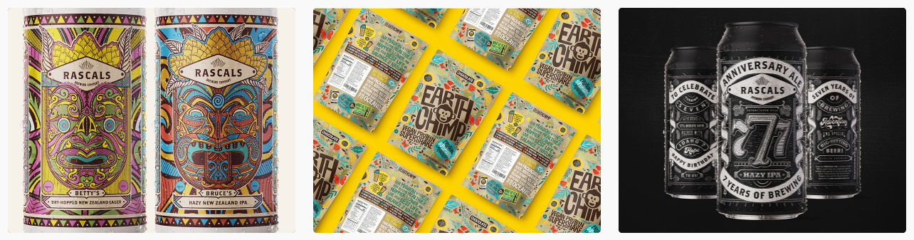
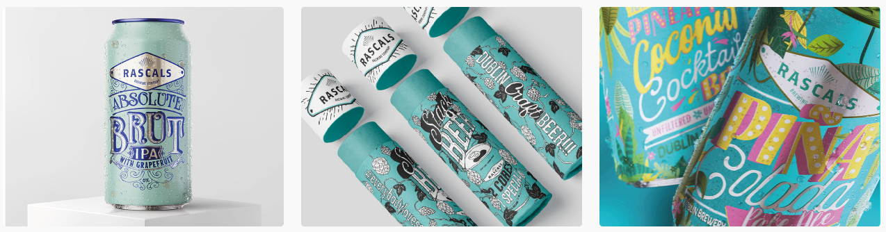
Tríona is a self tilted typographer and honestly in my years of design, typography is something that I've been a bit nervous to approach. Everybody has their own idea about type and how it should be and which typeface is best and what's traditionally bed. I think during this can project I would like to take inspiration from Tríona and maybe branch a bit more into doing some typography/illustration styles for the cans.
Her use of color is also absolutely class. Her work is really inspiring me to use more typography and illustration in my work and also experiment more with bolder colors that I wouldn't normally be used to using.
Her use of color is also absolutely class. Her work is really inspiring me to use more typography and illustration in my work and also experiment more with bolder colors that I wouldn't normally be used to using.